
Google Data Studio is able to automatically import data from Search Console, that allows marketers to visualise Google Search performance data and get SEO insights from the reports.
I would like to share my experience and suggestions for SEO reports made with Google Data Studio.
Plan before you start
There is so many data available it’s hard to fight a temptation to data puke and just put all the data in the report (have to confess I am also guilty in this). Think what data do you need, how are you planning to analyse it and prioritise what to put first.
That I would recommend to follow while working with Data Studio:
- Organise data in a logical way, start with most important data and then go deeper using different pages. Don’t try to squeeze all the data in one page.
- Segment your data – show it in different dimensions, do not just look at averages.
- Provide context for your KPI – show targets, compare with previous periods or other benchmarks. Just showing the number of clicks or average position won’t be actionable.
- Visualise data for better insights – make use of charts, heatmaps, bars and etc. Just don’t overuse it and use pie charts or put heatmaps for all the data just because you can.
And most importantly, ask yourself: If this chart/table/metric valuable for the report? What does it tell? How will it impact the analysis if it will be removed? Maybe this large pie chart with click or impression spit by device is not needed on a first screen if it does not really change frequently or provide any actionable insights? And if the device spilt does often change, will a pie chart be informative? Maybe better to have a table or a scorecard with a change shown in % or absolute numbers?
I decided to have the first page with an overview of Search results and use different pages for more detailed SEO data visualisations.
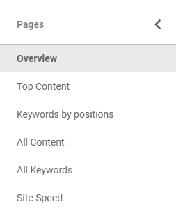
Overview
Here I have the most important metrics to evaluate the overall SEO situation with one glimpse. As you can see I have the data both from Google Analytics (Avg. Time Load, Session volume and user behavior from google / organic) and Search Console. The metrics are compared to previous period or displayed in charts to show the changes in time and trends.
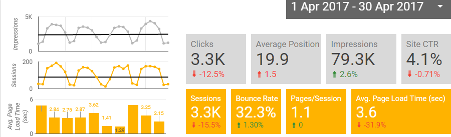
Since the example is for a blog, I’ve added only metrics like Impressions, Clicks, Avg. Position, Sessions and etc. If this would be an e-commerce or business website I would also add Conversions and Revenues from google / organic traffic source using Google Analytics connector.
From the charts I can see the that Search Impressions are increasing while Clicks and Sessions decreasing, so I have to check what could be the reason. Average Page Speed however is slightly higher that I would like to and have some spikes that would be good to check. Need to also double check with other pagespeed tools and find how to increase the time load in general.
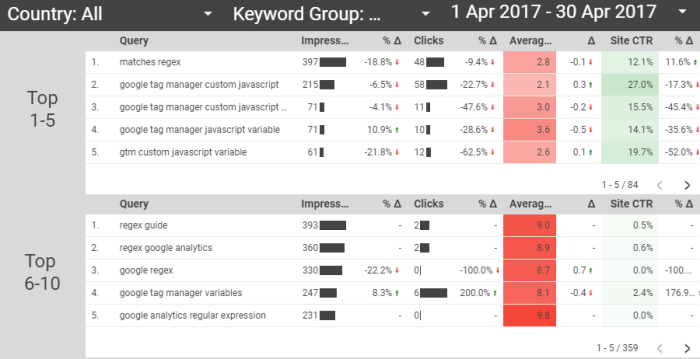
Next I have a keyword report.
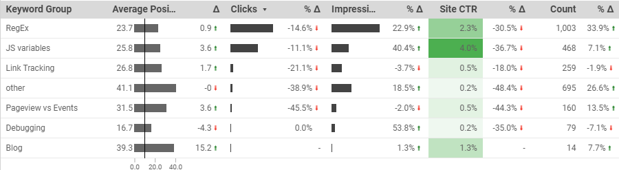
As there are few thousand of queries imported from Search Console, I have grouped them by article topics using a calculated field, CASE function and regular expressions.
CASE
 WHEN REGEXP_MATCH ( Query , "" ) THEN "not set"
 WHEN REGEXP_MATCH ( Query , ".*(regex|regular|match|path|url).*" ) THEN "RegEx"
 WHEN REGEXP_MATCH ( Query , ".*(pageview|virtual|event).*" ) THEN "Pageview vs Events"
 WHEN REGEXP_MATCH ( Query , ".*(link|click).*" ) THEN "Link Tracking"
 WHEN REGEXP_MATCH ( Query , ".*(javascript|js|variable|lowercase).*" ) THEN "JS variables"
 WHEN REGEXP_MATCH ( Query , ".*(debug|working).*" ) THEN "Debugging"
 WHEN REGEXP_MATCH ( Query , ".*blog.*" ) THEN "Blog"
 ELSE "other" END
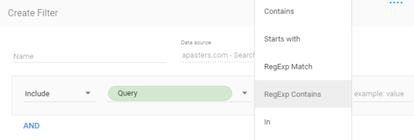
or you can have a filter with specific queries you are interested in, either using “In” or “RegExp” conditions.
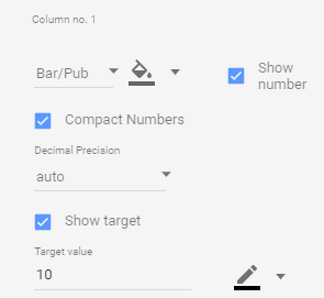
For the Avg. Positions I am using bar/pub visualisation with a set goal of 10, to see how close (or far) are the keywords from Top 10.
I am also using a calculated field with a count of keywords in each group, just to see how much there are and if there are significant increases and decreases.

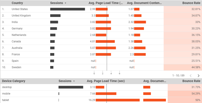
Then I have a geography report. I took the initial idea from the online-behavior.com blog post and added tables to see the changes vs. previous period, as well as data from Google Analytics to see the Bounce rate. Unfortunately Data Studio can’t merge data from different data sources, so have to stick with two separate tables.
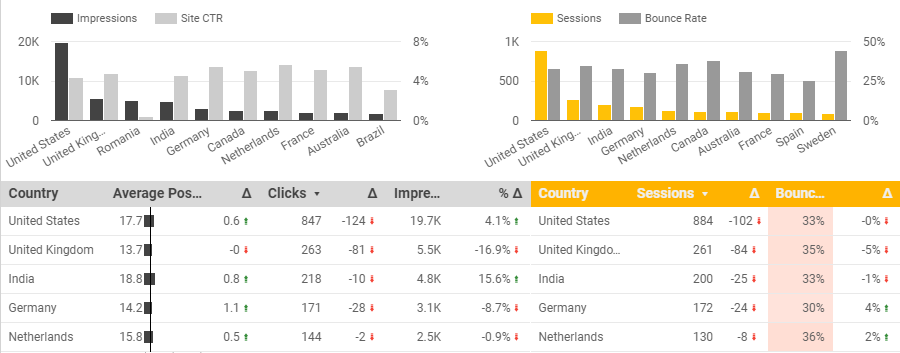
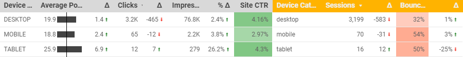
And similar tables for devices. Was surprised to see mobile CTR lower compared to Desktop having similar average positions. Guess no one goes this far on mobile :) Still looks like most of searches occur on desktops, so don’t worry much about it.
Top Content
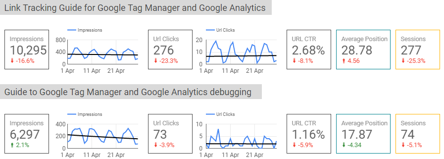
Since I have only few posts (that will hopefully grow) I am interested to see to how each is performing. That is why I have added a separate page with metrics and charts on each article I am interested in.
Here is an example for the 2 posts from my blog. For each graph I also have a trendline to better understand if impressions or clicks are growing or declining in time.
If you have much more content you could also group pages you want to analyse with a custom field and CAST function, as described in the keyword example above.
Keywords by positions
I have a separate page that has a table with all the queries, but I also wanted to quickly see how much and which queries or keywords have positions 1-5, 6-10, 10-20 and 20+. So for each table I have created a filter by Average. Position.
Site Speed
For the Site Speed report I have the table with Session volume, Time load metrics and Bounce rate with different Dimensions – Country, Device and also Landing page (not in the screenshot, but you get the idea). Since I am currently using the default sample size of 1% users tracked I am cautious with this data since in my case the sample is too small. Need to increase it to have more trusted data.
Closing thoughts
This is definitely not the best SEO report you can make in Data Studio, rather some ideas you could check in a quest for your own perfect report/dashboard. I will possibly tweak and change it in time and update this post with new learnings. Or not :)
As for the Google Data Studio – it is a great (free!) tool, but some things I am really missing:
- Connect data from different sources – for this particular case it was not critical, but in general I see it as a big disadvantage for now.
- More advanced data filtering – For example, you can’t have a scorecard with a metric filtered by another metric or custom dimension field.
- Crawling error data import – would be very convenient to see Search Console errors in Data Studio along with other data.
Also keep in mind that, at least at this point, Data Studio does not store the data, just processes and visualises it. And as the Search Console keeps data only for the last 90 days you will be able only to analyse the last 3 months, which for SEO could be quite a small time. Of course, you can manually download the data and then connect to Data Studio via Google Sheets connector, but it will also require to do some data joining before, since you would need to have all the data in one spreadsheet.
In my personal opinion, Data Studio and Search Console connection right now is a very nice way to visualise and analyse SEO data for the last month(s) and understand the general Search health status for the particular website, but not really suitable for a longer period SEO analysis and reporting.
[Update, 18/11/2017] Since I got many requests, sharing the report templates:
- Data Studio SEO report template v1 – as described in this post (some tables are broken since am using Sample Data)
- Data Studio SEO report template v2 – recommended to check first (slightly modified with all the tables working)
If you will have any issues or suggestions, write a comment below or just tweet me.
Here are some more resources on Data Studio I recommend to check:
- Reporting Search Performance in Google Data Studio by Daniel Waisberg
- Create Advanced Dimensions in Google Data Studio via these 6 Formulas by Ahmed Ali